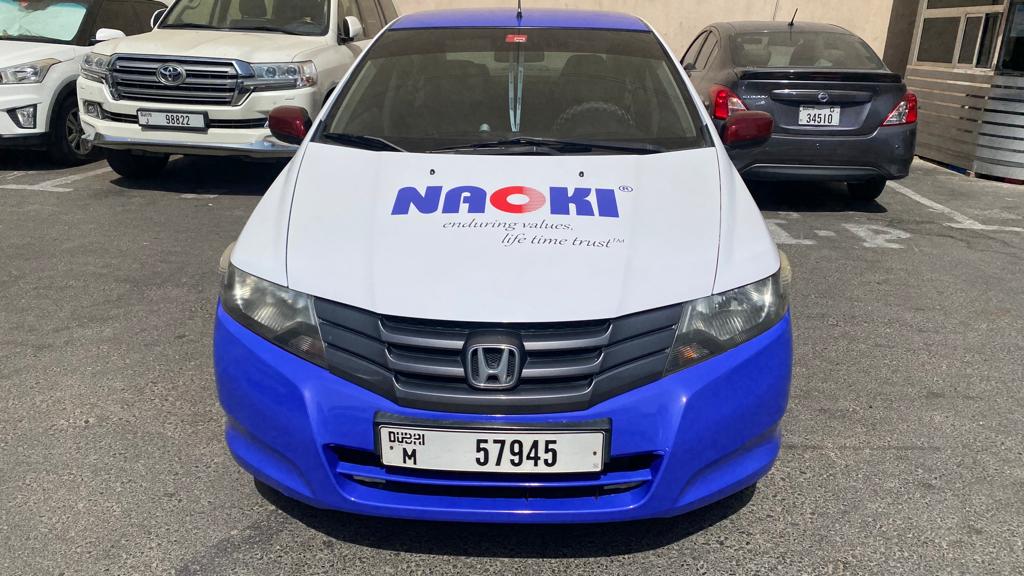
If you are looking to promote your business with vehicle branding in Dubai, it’s important to pay attention to the text usage in your vehicle graphics design. Effective vehicle graphics design can help your business stand out in a crowded market, but poorly executed designs can have the opposite effect.
When it comes to text usage in vehicle branding design, legibility is key. Your text should be easy to read from a distance, as well as quickly understandable for drivers passing by. This means using clear, bold, and large fonts that are easy to read. Additionally, it’s important to choose fonts that match your brand’s personality and message.
Importance of Text in Vehicle Branding Design in Dubai
Text is a crucial element in vehicle branding design. It allows you to communicate your brand’s message and identity to potential customers. Effective text usage can help you convey your message clearly and concisely, making it easier for customers to understand what your brand is all about. When using text in your graphics design, it’s important to keep a few things in mind.
- Readability: You need to make sure that your text is legible. This means choosing a font that is easy to read, even from a distance. It’s also important to use contrasting colors to make your text stand out against the background.
- Text Placement: Another important consideration is the placement of your text. You want to make sure that your text is placed in a location that is easy to see and read. This might mean placing your text on the side of the vehicle or the back door.

Text Placement Strategies for Vehicle Graphics Design in Dubai
When it comes to vehicle branding design, text usage plays a crucial role in conveying your brand’s message to potential customers. Here are some effective text placement strategies that you can use to enhance the visibility and legibility of your brand message.
- Visibility and Legibility: The success of your vehicle branding campaign depends on the clarity and simplicity of your design. It’s important to create designs that are simple enough to understand even at a glance. This clarity ensures that your brand message is communicated effectively to the audience, regardless of the speed at which the vehicle is traveling. To ensure maximum visibility and legibility, use high-contrast colors for your text and background.
- Balancing with Graphics and Imagery: While text is important, it’s equally important to balance it with graphics and imagery. Use images and graphics that are relevant to your brand and complement your text message. This helps to reinforce your brand identity and make your message more memorable.
Looking For Affordable Vehicle Branding Solution? Contact Printajo
Regulations and Legal Considerations in Dubai
When it comes to vehicle branding design in Dubai, it is important to be aware of the regulations and legal considerations that apply to text usage. This will help you avoid potential legal disputes or violations.
- Dubai’s Advertising Laws: Dubai has strict laws and regulations governing advertising, including vehicle branding. The Roads and Transport Authority (RTA) is responsible for regulating vehicle branding in Dubai. All advertising must be approved by the RTA prior to being placed on a vehicle. This includes logos, trademarks, or copyrighted material used in the branding.
- Traffic and Safety Regulations: There are also traffic and safety regulations that must be followed when designing and branding a vehicle in Dubai. The size and placement of the branding must comply with RTA regulations. This is to ensure that the branding does not obstruct the driver’s view or distract other drivers on the road.
Always be aware of advertising laws and traffic and safety regulations for vehicle graphics design in Dubai.
Tips For Effective Text Usage in Vehicle Branding Design
Here are some tips for effective text usage in vehicle branding design:
- Keep it simple and clear: The success of vehicle branding depends on the clarity and simplicity of the design. It’s important to create designs that are straightforward and easily comprehensible, even at a glance
- Use contrasting colors: The text should be easy to read and stand out from the background. Use contrasting colors to make the text more visible.
- Highlight the essentials: The core of effective vehicle wrap design lies in emphasizing key information including your brand name, services, and contact details.
- Avoid complexity: complex designs can be overwhelming and confusing to potential customers. Avoid using too many graphics, images, or text. Keep the design simple.
- Consider the placement of the text: The placement of the text is important in vehicle graphics design. The text should be placed in a way that is easily visible to potential customers.
Conclusion
The right use of text in vehicle branding design can make a significant impact on the success of a branding campaign. The text should be strategically placed, relevant to the brand, engaging, visible, and legible. By following these guidelines, you can create effective vehicle branding designs that capture the audience’s attention and convey the brand’s message.


